Selections Plugin Configuration
Installation
Projects generated with the Bloomreach Content Maven archetype include the Selections plugin by default.
For other projects, or older versions, add the Selections plugin using the setup application.
Configuration
Value Lists
The Selections plugin uses a value list service to supply options for selection widgets. By default, value lists are managed as Value List documents in the Content application.
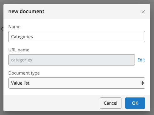
To create a Value List document:
- In the CMS, open the Content application.
- Navigate to an existing folder or create a new one, such as
myproject/Value Lists. - Add a new document and select the "Value List" document type.
- In the new Value List document, enter a key and a label for each value.
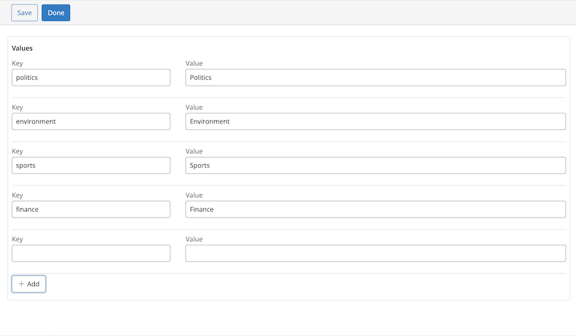
- Save the document.
Info: Value List documents do not use workflow. They are not published, and changes take effect immediately after saving.
Hint: You can source value lists from a REST service or database by implementing a custom value list provider. Implement
org.onehippo.forge.selection.frontend.provider.ValueListProvider, register it in the repository, and reference it from the field'svaluelistProviderproperty. See Custom Value List Providers for details on the interface contract, registration, and migration from earlier provider versions.
Add a Selection Field to a Document Type
Using the Setup Application
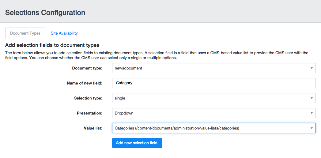
The setup application provides a user interface to add Selection fields to an existing document type.
- In the setup application, select Tools.
- Locate Selections and click the Use Selections button.

- Select the document type where you want to add the Selection field.
- Enter a name for the new field.
- In the Selection type field, select either single or multiple.
- In the Presentation field, select the widget type (Dropdown or Radioboxes for single; Selectlist, Checkboxes, or Palette for multiple). Additional configuration options may appear depending on the widget.
- Choose a value list to populate the selection widget.
- Click Add new selection field.
To verify your changes, open the CMS and edit a document of the selected document type.

To change the field position in the editing template, use the Document Type Editor.
Hint: For information on configuring and using selection fields in the delivery tier, see Delivery Tier Configuration and Implementation.
Using the Document Type Editor
The Selections plugin adds several field types to the Document Type Editor:
Static Dropdown
A dropdown widget for selecting a single value, populated from a static value list defined as comma-separated values in the field properties.

Specify values in the selectable.options property.
Each option can be a key/label pair, separated by the first '=':
ca=Canada,mx=Mexico,us=United States
If no '=' is present, the key is also used as the label:
Canada,Mexico,United States
Dynamic Dropdown
A dropdown widget for selecting a single value, populated from a value list service.

Specify the location of the Value List document as an absolute JCR path in the source property, for example:
/content/documents/administration/value-lists/countries
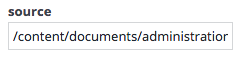
Optional field properties are available in the right column. The table below lists all available properties:
| Property | Description |
|---|---|
| valuelistProvider | Optional. Service name of a custom value list provider, such as service.valuelist.countries. Defaults to service.valuelist.default, which uses DocumentValueListProvider to read a Value List document specified by source. Fields with a custom provider render in both the CMS document editor and Experience Manager. See Custom Value List Providers. |
| source | Input for the configured value list provider. For the default provider, specify the absolute path (starting with /) or the handle UUID of a Value List document. Optional if a custom provider is configured; the value is passed unchanged and can be omitted if not required by the provider. |
| sortComparator | Optional. Fully qualified class name of an implementation of org.onehippo.forge.selection.frontend.plugin.sorting.IListItemComparator. The standard implementation is org.onehippo.forge.selection.frontend.plugin.sorting.DefaultListItemComparator, which sorts alphanumerically. |
| sortOrder | Optional. Either 'ascending' or 'descending'. Defaults to 'ascending'. |
| sortBy | Optional. Either 'key' or 'label'. Defaults to 'label'. |
| showDefault | Used by org.onehippo.forge.selection.frontend.plugin.DynamicDropdownPlugin. Defines whether the default value "Choose One" is shown. |
| observableId | Optional. User-defined observable ID. If provided, the dropdown creates a background service containing an observable model of its value. The ID should be unique per document editor instance, typically by prefixing with ${cluster.id}. |
| observerId | Optional. User-defined observer ID that matches another dropdown's observableId (including ${cluster.id}). The observer dropdown listens for changes in the observable dropdown's model and uses that value to retrieve a value list and update itself. |
| nameProvider | Fully qualified class name of an implementation of org.onehippo.forge.selection.frontend.provider.IValueListNameProvider. This class converts an observed value into a value list name (path or UUID). The resulting name is used to retrieve the value list from the configured provider. If not specified, BasePathNameProvider is used. Standard implementations: - org.onehippo.forge.selection.frontend.provider.BasePathNameProvider (default): Concatenates sourceBasePath and the observed value. Value list item keys must match the node names of the dependent value lists.- org.onehippo.forge.selection.frontend.provider.ConfiguredNameProvider: Looks up value list names in the configuration using the key source. + (observed value).- org.onehippo.forge.selection.frontend.provider.NOOPNameProvider: Returns the observed value as the value list name, useful with a custom provider. |
| sourceBasePath | Used by org.onehippo.forge.selection.frontend.provider.BasePathNameProvider. Defines the absolute base path where dependent value list documents are located. |
Hint: You can also add and configure Dynamic Dropdown fields using the setup application.
Info: Starting with brXM 16.9.2 and 17.1.0, fields with a custom
valuelistProviderrender in the Experience Manager. Providers that extend Wicket's Plugin are not supported. See Custom Value List Providers.
Radio Group
A radio button group widget populated from a value list service.
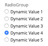
Specify the Value List document location as an absolute JCR path in the source property, for example:
/content/documents/administration/value-lists/countries
All other field properties are optional. The table below lists the available properties:
| Property | Description |
|---|---|
| valuelistProvider | Optional. Service name of a custom value list provider, such as service.valuelist.countries. Defaults to service.valuelist.default, which uses DocumentValueListProvider to read a Value List document specified by source. Fields with a custom provider render in both the CMS document editor and Experience Manager. See Custom Value List Providers. |
| source | Input for the configured value list provider. For the default provider, specify the absolute path (starting with /) or the handle UUID of a Value List document. Optional if a custom provider is configured; the value is passed unchanged and can be omitted if not required by the provider. |
| sortComparator | Optional. Fully qualified class name of an implementation of org.onehippo.forge.selection.frontend.plugin.sorting.IListItemComparator. The standard implementation is org.onehippo.forge.selection.frontend.plugin.sorting.DefaultListItemComparator, which sorts alphanumerically. |
| sortOrder | Optional. Either 'ascending' or 'descending'. Defaults to 'ascending'. |
| sortBy | Optional. Either 'key' or 'label'. Defaults to 'label'. |
| orientation | Optional. Either 'vertical' or 'horizontal'. Defaults to 'vertical'. |
Info: Starting with brXM 16.9.2 and 17.1.0, fields with a custom
valuelistProviderrender in the Experience Manager. Providers that extend Wicket's Plugin are not supported. See Custom Value List Providers.
Boolean Radio Group
A radio button group widget for boolean values. The labels for true and false can be populated from a value list document.
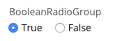
Specify the value list document location as an absolute JCR path in the source property, for example:
/content/documents/administration/value-lists/choicelabels
All field properties are optional. The table below lists the available properties:
| Property | Description |
|---|---|
| source | > Info: Available since brXM 13.2.0. String property pointing to a value list document by its absolute path (starting with '/') or the UUID of the value list document's handle. The value list must contain two keys: "true" and "false". Other or duplicate entries are ignored. If not found, the default labels "true" and "false" are used. |
| orientation | > Info: Available since brXM 13.2.0. Optional. Either 'vertical' or 'horizontal'. Defaults to 'vertical'. |
| trueLabel | Deprecated since version 13.2.0. Use a value list document specified in the source property instead. String property to override the default 'true' label. |
| falseLabel | Deprecated since version 13.2.0. Use a value list document specified in the source property instead. String property to override the default 'false' label. |