Device Preview
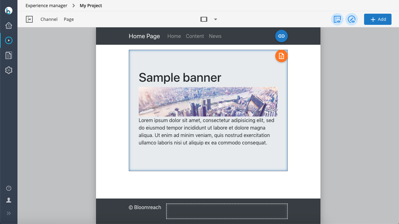
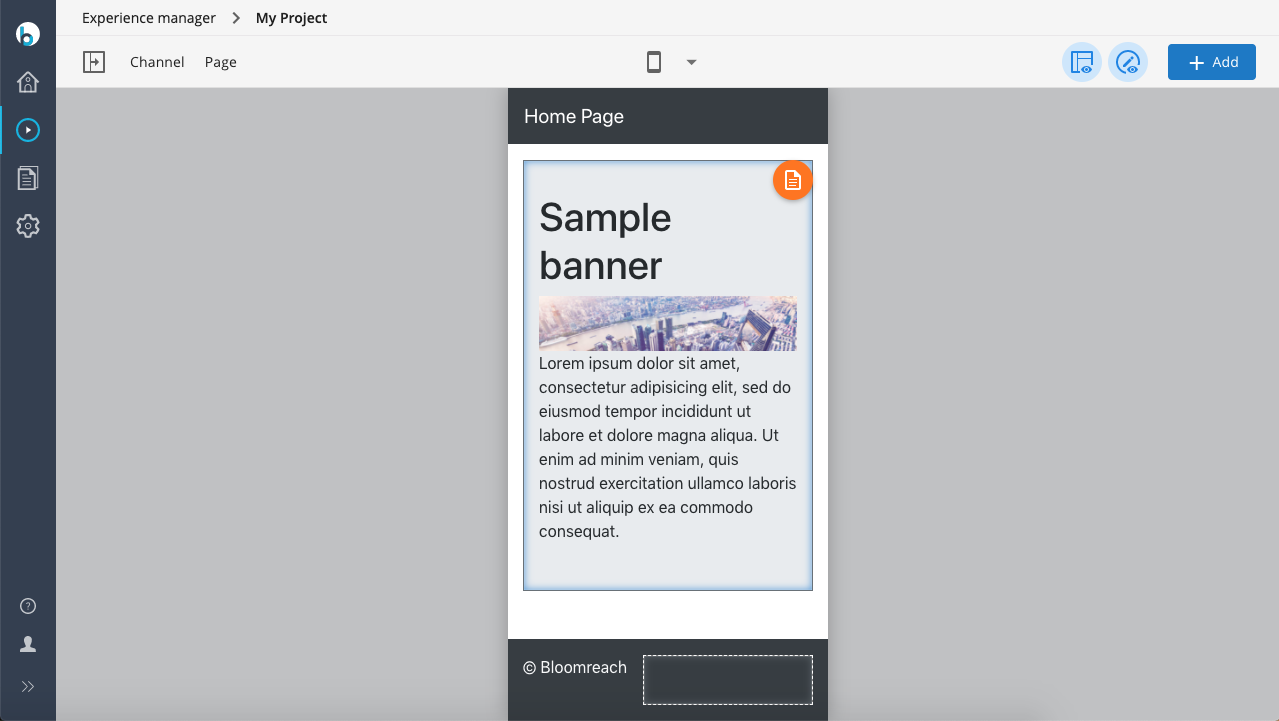
The Experience manager provides a way to preview channel pages at different viewport widths. This feature helps you evaluate how your website appears on various devices, including tablets and smartphones.
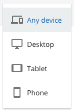
By default, the Experience manager includes these viewport width options:
- Responsive: No fixed width. The page reflows as you resize the window or open side panels.
- Desktop: Fixed at 1280px.
- Tablet: Fixed at 720px.
- Smartphone: Fixed at 320px.
Use the drop-down menu in the center of the Experience manager toolbar to select a viewport width.