Adapt the Base Page Configuration to the Web Design
Previous Step
After adding static resources to your project, you can apply the web design's HTML markup to your templates. This step updates the out-of-the-box features to match the GoGreen website's appearance.
The Base Page Layout
Review the common page elements identified in the web design:
- Header
- Logo
- Search box
- Navigation menu
- Country selection (not in sprint scope)
- Footer
- Logo
- Navigation menu (not in sprint scope)
Compare these with the elements present in the site generated by Essentials:
- Header
- Navigation menu
- Footer
Most base page template elements are present but do not match the web design. You will update these elements to align with the design.
Bloomreach Content Pages and Templates
In Bloomreach Content, each page configuration is a hierarchy of components. Each component uses its own template.
Info: Components may contain business logic, but when using out-of-the-box features, you do not need to modify this logic.
The root component's template provides the HTML structure, including the <html>, <head>, and <body> tags, along with CSS and JavaScript references. Templates for child components (such as header and footer) are included using <@hst.include> tags.
Freemarker templates are located in repository-data/webfiles/src/main/resources/site/freemarker. Review these files and match them to the generated site's pages and elements.
To apply the web design, update the templates with the design's HTML markup.
Copy the HTML from the Web Design to the Root Component's Template
- Open
repository-data/webfiles/src/main/resources/site/freemarker/gogreen/base-layout.ftl. This template defines the base page configuration's root component and contains the HTML structure. - Open
index.htmlfrom the web design. This file contains the required HTML markup. - In
index.html, select the<html>element and all its contents. Copy this selection. - In
base-layout.ftl, wrap the existing<html>element and its contents in a comment tag (<#-- ... -->). Retain this as a reference while updating the template. - Paste the copied HTML from
index.htmlintobase-layout.ftldirectly after the line:
<#include "../include/imports.ftl">
Remove Non-Common Elements
The pasted HTML markup includes homepage-specific content. Only retain markup for common page elements.
- In the HTML body, locate and remove the
<div id="banner-carousel">element and all its contents, including any surrounding empty<div>. - Locate and remove the
<div class="content-wrapper home">element and all its contents.
Resolve Links to Static Resources
Static resource URLs must be resolved dynamically to support different deployment contexts. Use the <@hst.webfile> tag for this purpose. Refer to the original Freemarker code (now commented out) for examples.
- For each
<link>element with anhrefattribute, replace the value with an<@hst.webfile>tag. For example:
<link rel="stylesheet" media="screen" type="text/css" href="css/yui-css.css" />
becomes
<link rel="stylesheet" media="screen" type="text/css" href="<@hst.webfile path="/css/yui-css.css"/>" />
The path attribute in <@hst.webfile> must start with a slash.
- Apply the same approach to all
<script>elements by updating theirsrcattributes. - Update all
<img>elements to use<@hst.webfile>in theirsrcattributes.
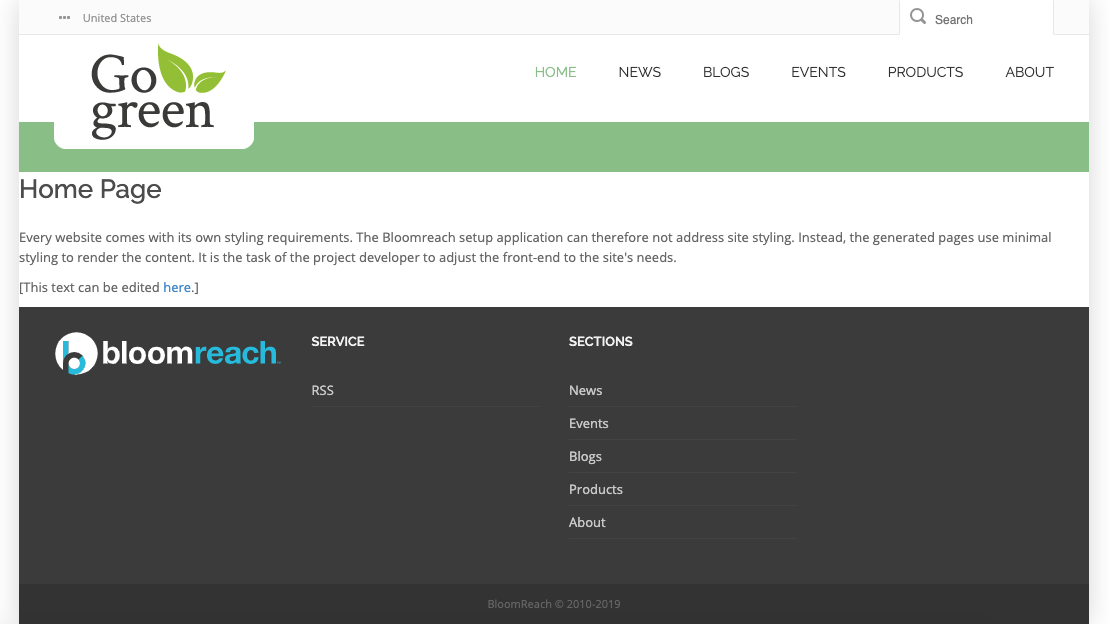
After updating, view the result in your browser. The GoGreen base page layout should appear, but navigation links will not yet function.
Include Head Contributions
Some components may require additional CSS or JavaScript files. These are added as head contributions. The top-level component's template must include these contributions.
- In the HTML
<head>element, insert the following line just before</head>:
<@hst.headContributions categoryIncludes="htmlHead" xhtml=true/>
- In the HTML
<body>element, insert the following line just before</body>:
<@hst.headContributions categoryIncludes="htmlBodyEnd" xhtml=true/>
Header Navigation Menu
In base-layout.ftl, locate the second <nav> element (with a child <ul class="navigation" id="main-navigation">). This is the header navigation menu, currently static HTML from the web design.
- After the closing
</nav>tag, add:
<@hst.include ref="menu"/>
- Copy the
<nav>element and its contents to the clipboard, then remove it frombase-layout.ftl. - Open
repository-data/webfiles/src/main/resources/site/freemarker/gogreen/base-top-menu.ftl. This template renders the dynamic navigation menu. The<@hst.include>tag inbase-layout.ftlwill render the output ofbase-top-menu.ftlat this location. - In
base-top-menu.ftl, wrap the existing Freemarker code in a comment tag (<#-- ... -->) for reference. - Paste the
<nav>element from the clipboard intobase-top-menu.ftl. - Update the menu to render dynamically using Freemarker. Use the original commented code as a reference. The result should be similar to:
<#include "../include/imports.ftl"> <#if menu??> <#if menu.siteMenuItems??> <nav> <ul class="navigation" id="main-navigation"> <#list menu.siteMenuItems as item> <#if item.selected || item.expanded> <li><a href="<@hst.link link=item.hstLink/>" class="activelink"><span class="label-nav">${item.name?html}</span> </a></li> <#else> <li><a href="<@hst.link link=item.hstLink/>"><span class="label-nav">${item.name?html}</span></a></li> </#if> </#list> </ul> </nav> </#if> <@hst.cmseditmenu menu=menu/> <#else> <#if editMode> <h5>[Menu Component]</h5> <sub>Click to edit Menu</sub> </#if> </#if>
- Remove the original commented code.
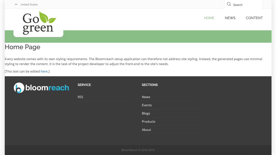
View the result in your browser. The header navigation menu now displays dynamic menu items from the generated website, replacing the static items from the web design. Each item links to a different page, but the main content area remains unstyled.
Footer
In base-layout.ftl, find the <footer> element.
- After the closing
</footer>tag, add:
<@hst.include ref="footer"/>
- Copy the
<footer>element and its contents to the clipboard, then remove the element and its contents frombase-layout.ftl. - Open
repository-data/webfiles/src/main/resources/site/freemarker/gogreen/base-footer.ftl. - Remove all existing HTML in
base-footer.ftland replace it with the clipboard contents.
The footer remains static HTML for now.
Main Content Area
The base page configuration serves as an abstract configuration extended by other page configurations. Each specific page configuration will provide a main content area between the header and footer. The base page configuration must include a placeholder for this content.
- In
base-layout.ftl, locate the<div class="top-title-wrapper">element. - After its closing
</div>, add:
<@hst.include ref="main"/>
- Remove any original commented code from
base-layout.ftl.
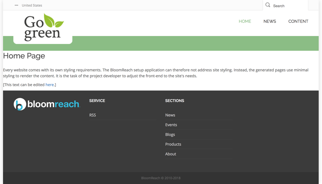
View the result in your browser. All pages linked from the navigation menu now display content in the main area between the header and footer, though the content is not yet styled.
Next Step
Full Source Code
Below are the complete source files referenced in this guide.
base-layout.ftl
<!doctype html> <#include "../include/imports.ftl"> <html class="no-js" lang="en"> <head> <title>Bloomreach Go Green - Home</title> <meta charset="utf-8"> <meta name="viewport" content="width=device-width, initial-scale=1.0"> <link rel="stylesheet" href="<@hst.webfile path="/css/bootstrap.css"/>"> <link rel="stylesheet" href="<@hst.webfile path="/css/font-awesome.css"/>"> <link href='<@hst.webfile path="/css/style.css"/>' rel='stylesheet' type='text/css'> <link href='<@hst.webfile path="/css/responsive.css"/>' rel='stylesheet' type='text/css'> <!-- Fonts --> <link href="<@hst.webfile path="/fonts/open-sans.css"/>" rel='stylesheet' type='text/css'> <link href="<@hst.webfile path="/fonts/raleway.css"/>" rel='stylesheet' type='text/css'> <link rel="stylesheet" media="screen" type="text/css" href="<@hst.webfile path="/css/hippo-green.css"/>" /> <link rel="icon" href="<@hst.webfile path="/images/favicon.ico"/>" type="image/x-icon" /> <link rel="shortcut icon" href="<@hst.webfile path="/images/favicon.ico"/>" type="image/x-icon" /> <link rel="apple-touch-icon" href="<@hst.webfile path="/images/apple-touch-icon.png"/>" /> <link rel="alternate" type="application/rss+xml" title="Bloomreach Go Green RSS" href="rss" /> <@hst.headContributions categoryIncludes="htmlHead" xhtml=true/> </head> <body class="bgpattern-neutral"> <div id="wrapper" class="boxed"> <div class="top_wrapper"> <div class="top-bar"> <div class="container"> <div class="row"> <!-- lang navigation --> <div class="col-sm-7 langnav"> <nav> <ul class="" id="language"> <li class="active"><i class="fa fa-ellipsis-h"></i> <span>United States</span> <ul> <li><a href="fr.html">France</a></li> </ul></li> </ul> </nav> </div> <div class="col-sm-5" id="top-search"> <div class="searchbox"> <form action="search.html" method="get"> <input type="text" class="searchbox-inputtext" id="searchbox-inputtext" name="query" placeholder="Search" /> <label class="searchbox-icon" for="searchbox-inputtext"></label> <input type="submit" class="searchbox-submit" value="Search" /> </form> </div> </div> </div> </div> </div> <!-- Header --> <header id="header"> <div class="container"> <div class="row header"> <!-- Logo --> <div class="col-xs-2 logo"> <a href="index.html"><img src="<@hst.webfile path="/images/gogreenlogo2.png"/>" alt="" height="107" /></a> </div> <!-- //Logo// --> <!-- Main navigation --> <!-- Navigation File --> <div class="col-md-12"> <!-- Mobile Button Menu --> <div class="mobile-menu-button"> <i class="fa fa-list-ul"></i> </div> <!-- //Mobile Button Menu// --> <@hst.include ref="menu"/> <!-- Mobile Nav. Container --> <ul class="mobile-nav"> <li class="responsive-searchbox"> <!-- Responsive Nave --> <form action="index.html#" method="get"> <input type="text" class="searchbox-inputtext" id="searchbox-inputtext-mobile" name="s" /> <button class="icon-search"></button> </form> <!-- //Responsive Nave// --> </li> </ul> <!-- //Mobile Nav. Container// --> </div> <!-- //Main navigation// --> </div> </div> </header> <!-- //Header// --> </div> <!-- body / main --> <div class="content-wrapper"> <div class="top-title-wrapper"> <div class="container"> <div class="row"> <div class="col-md-12 col-sm-12"> <div class="page-info"> </div> </div> </div> </div> </div> <@hst.include ref="main"/> </div> <!-- footer --> <@hst.include ref="footer"/> </div> <script src="<@hst.webfile path="/js/jquery-3.5.1.min.js"/>" type="text/javascript"></script> <script src="<@hst.webfile path="/js/bootstrap.min.js"/>" type="text/javascript"></script> <script src="<@hst.webfile path="/js/kanzi-menu.js"/>" type="text/javascript"></script> <@hst.headContributions categoryIncludes="htmlBodyEnd" xhtml=true/> </body> </html>
base-top-menu.ftl
<#include "../include/imports.ftl"> <#if menu??> <#if menu.siteMenuItems??> <nav> <ul class="navigation" id="main-navigation"> <#list menu.siteMenuItems as item> <#if item.selected || item.expanded> <li><a href="<@hst.link link=item.hstLink/>" class="activelink"><span class="label-nav">${item.name?html}</span> </a></li> <#else> <li><a href="<@hst.link link=item.hstLink/>"><span class="label-nav">${item.name?html}</span></a></li> </#if> </#list> </ul> </nav> </#if> <@hst.cmseditmenu menu=menu/> </#if>
base-footer.ftl
<#include "../include/imports.ftl"> <footer> <div class="footer"> <div class="container"> <div class="footer-wrapper"> <div class="row"> <!-- Footer Col. --> <div class="col-md-3 col-sm-3 footer-col"> <div class="footer-content"> <div class="footer-content-logo"> <a href="https://www.onehippo.com" target="_blank"> <img src="<@hst.webfile path="/images/logo-bloomreach.svg"/>" alt="onehippo.com" /> </a> </div> </div> </div> <!-- //Footer Col.// --> <!-- Footer Col. --> <div class="col-md-3 col-sm-3 footer-col"> <div class="footer-title">SERVICE</div> <div class="footer-content footer-recent-tweets-container"> <ul class="footer-category-list"> <li><a href="rss">RSS</a></li> </ul> </div> </div> <!-- //Footer Col.// --> <!-- Footer Col. --> <div class="col-md-3 col-sm-3 footer-col"> <div class="footer-title">SECTIONS</div> <div class="footer-content"> <ul class="footer-category-list"> <li><a href="news.html">News</a></li> <li><a href="events.html">Events</a></li> <li><a href="blogs.html">Blogs</a></li> <li><a href="products.html">Products</a></li> <li><a href="about.html">About</a></li> </ul> </div> </div> <!-- //Footer Col.// --> <!-- Footer Col. --> </div> </div> </div> <div class="copyright"> <div class="container"> <div class="row"> <div class="col-md-12 col-sm-12 center-text"> <div class="copyright-text">Bloomreach © 2010-2019</div> </div> </div> </div> </div> </div> </footer>