Open UI Style Guide
Use this style guide to align your Open UI extension’s appearance with the Bloomreach Content user interface.
Input Fields
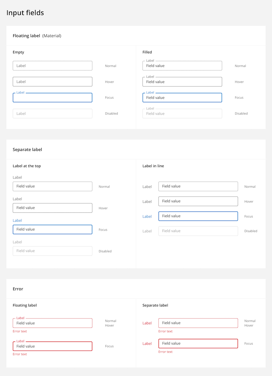
Floating Label (Material)
Apply the following specifications for input fields with floating labels:
- Field height: 36px
- Corner radius: 4px
- Padding: 14px
- Value text: Open Sans 14, #000000 at 87% opacity
- Placeholder label: Open Sans 14, #000000 at 60% opacity
- Floating label font: Open Sans 12
- Spacing between fields: 24px
Separate Label
For input fields with separate labels, use these specifications:
- Field height: 36px
- Corner radius: 4px
- Padding: 14px
- Value text: Open Sans 14, #000000 at 87% opacity
- Label: Open Sans 14, #000000 at 60% opacity
Label placement and spacing:
- Label above field: 6px between label and field
- Between bottom of field and top of next label: 20px
Label inline with field:
- Minimum 24px between label and field
- 24px between adjacent fields
State Changes (Floating Label and Separate Label)
Adjust field appearance based on interaction state:
Normal
- Border: #000000 at 38% opacity, 1px
- Label: #000000 at 60% opacity
- Field value: #000000 at 87% opacity
- Icon: #000000 at 60% opacity
Hover
- Border: #000000 at 60% opacity, 1px
Focus
- Border: #147AC8 (primary color), 2px
- Label: #147AC8 (primary color)
Disabled
- Border: #000000 at 12% opacity, 1px
- Label: #000000 at 38% opacity
- Field value: #000000 at 38% opacity
- Icon: #000000 at 38% opacity
Error State
- Error color: #D40022
- Error text: Open Sans 12px, #D40022
- Spacing between field and error text: 6px
Buttons
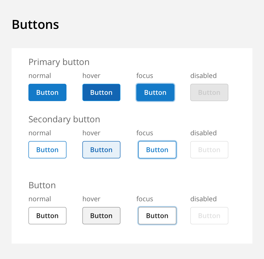
General Button Specifications
Apply these properties to all button types:
- Height: 36px
- Minimum width: 64px
- Left and right text padding: 16px
- Corner radius: 4px
- Font: Open Sans 14 semibold
- Border width: 1px
Focus rectangle:
- Box shadow: #A9CDE8, 2px
Disabled state:
- Border color: #000000 at 12% opacity
- Font color: #000000 at 38% opacity
Primary Button
Normal
- Fill color: #147AC8 (primary color)
- Border color: #147AC8 (primary color)
- Font color: #FFFFFF
Hover
- Fill color: #1265B3
- Border color: #1265B3
Disabled
- Fill color: #000000 at 5% opacity
Secondary Button
Normal
- Fill color: transparent
- Border color: #147AC8 (primary color)
- Font color: #147AC8 (primary color)
Hover
- Fill color: #147AC8 at 10% opacity
- Border color: #1265B3
- Font color: #1265B3
Default Button
Normal
- Fill color: transparent
- Border color: #000000 at 38% opacity
- Font color: #000000 at 87% opacity
Hover
- Fill color: #147AC8 at 10% opacity
- Border color: #1265B3
- Font color: #1265B3